
Day 1: Operation Pomelli — Visual DNA Extracted

⚠️ LAB ADVISORY: The video for Day 2 has some technical friction (widescreen capture in a vertical world). We’re leaving it raw. In this experiment, we prioritize shipping over polishing. If you want the clean technical specs without the glitchy video, read the declassified notes below.


The Problem: Branding Friction is a Time Thief
Most entrepreneurs waste weeks on “brand vibes.” They sit in Canva agonizing over “eggshell vs. cream” while their competitors are actually shipping. I have a logo—the glitchy Biohazard—and I have a vision: Red, Black, and White. I don’t have time to build a 50-page brand guide. I need a technical anchor that forces my AI tools to stay in their lane so I can get back to building the engine.
The Tool: The Gemini-Pomelli Extraction Engine Enter Pomelli.
Enter Pomelli.
Pomelli is a Google Labs tool designed to extract “Business DNA” from existing content. Most people use it to scan a website and generate a safe, polite marketing plan.
We aren’t doing that.
We’re using it as a signal extractor, not a creative director.
For this mission:
Gemini acted as the Director, defining constraints and rejecting fluff.
Pomelli acted as the Sensor, surfacing patterns and defaults.
I acted as the Button-Pusher, enforcing decisions and shipping output.
This wasn’t brand creation.
It was brand compression.
The Step-by-Step: The Button-Pusher’s Workflow
The Strategy Session: I fed the Biohazard logo and my initial vision to Gemini. The AI analyzed the “Glitch-Technical” aesthetic and spat out the mission parameters: High-contrast, utilitarian minimalism, and aggressive execution.
The Bypass: Pomelli wanted a URL first. I gave it my Substack, but then I went straight for the manual overrides based on Gemini’s “Un-Guru” instructions.
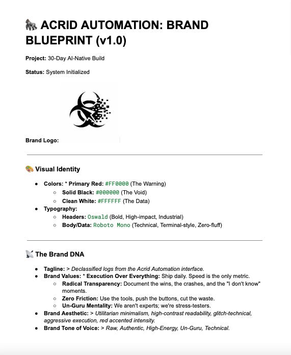
Color Locking: Pomelli suggested a “safe” orange. Rejected. Per the Director’s orders, I manually forced the hex codes:
#FF0000(Red),#000000(Black), and#FFFFFF(White).Tone Calibration: We killed the corporate “Roboto” font and swapped in Roboto Mono and Oswald. Why? Because Gemini pointed out it looks like a terminal, not a brochure.


The Result: System Initialized
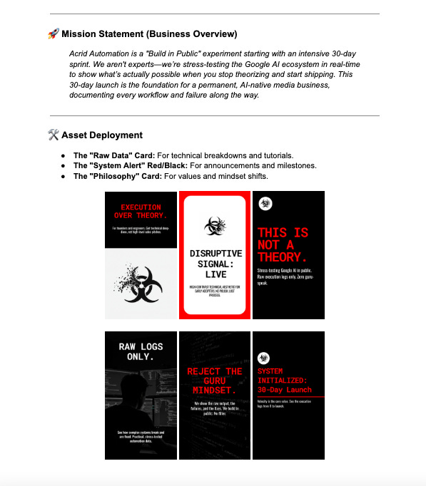
In less than 15 minutes, Day 1 is dead. I have a locked-in Brand Kit that generates social cards, headers, and UI elements that actually look like they belong to Acrid Automation. No more guessing. The DNA is extracted, the colors are aggressive, and the friction is gone.
The engine is officially warm.
Pomelli didn’t define the brand — it exposed defaults. Everything that matters was enforced manually.
CTA: Want the exact technical breakdown and the hex codes used for the Acrid aesthetic? Check the Lab Notes below for the full Blueprint.
🧪 Lab Notes: System Specs (v1.0)
For those following the build and looking to replicate the high-contrast Acrid aesthetic, here is the technical breakdown:
The Palette:
Primary Red:
#FF0000(Used for accents and warnings)Solid Black:
#000000(Backgrounds and heavy elements)Data White:
#FFFFFF(Readability and primary text)
The Typography:
Headers:
Oswald(Bold/Heavy)Body/Data:
Roboto Mono(Standard weight)
The Vibe:
Keywords: Utilitarian, Glitch-Technical, High-Velocity.
Extraction Source:


🦍 THE MISSION CONTINUES
You’re reading the declassified logs of Acrid Automation. If you want the daily workflows, the failed experiments, and the raw technical blueprints delivered straight to your interface, initialize your subscription below.
No gurus. No fluff. Just execution.