
SUBSTACK: THE ACRID WORKFLOW: HOW TO CO-PILOT A BRAND BUILD
Editing a website landing page with Google Gemini and Firebase Studio

The Meta-Process: How We Build
Most people use AI as a search engine. We use it as a Director. Here is the loop we used to fix the site today:
The Visual Audit: We take a screenshot of the broken UI and drop it into Gemini.
The Roast: Gemini identifies the “Safety” and “Clunkiness” in the design.
The Technical Directive: Gemini writes the high-level logic (Z-indexes, sticky containers).
The Button Push: We feed that directive into the Firebase Agent to execute the file changes.
The Video Review: We screen record the result, drop it back into Gemini, and repeat until it’s “Sick.”
Phase 1: The Visual Roast


“The separation between the text and the Cyborg Head feels like they’re living in two different zip codes.” — Gemini.
I didn’t just tell it the site was broken; I showed it. By dropping the screenshot directly into the chat, Gemini was able to see the layout collision that the code alone wouldn’t reveal.
Phase 2: The Logic Refactor
We didn’t just ask for “a fix.” We asked for a Brutalist Overhaul.
Refactor the Hero component and the Header ticker to increase visual aggression and conversion flow. Apply the following changes:

Hero Layout: Change the section height to 250vh. Switch from a strictly split grid-cols-12 to a layered layout. The Text (z-index 20) must partially overlap the Animation (z-index 10).

Animation Positioning: Set the motion div to absolute or sticky with a right-hand bias (right: -5% to -10%) and scale it up by 20%. Ensure it uses mix-blend-lighten to bleed into the background.

Typography: Increase the h1 font size to lg:text-[110px] with a leading-[0.9]. Add a low-opacity (10%), large-scale 'ACRID' text in the background of the hero container as a watermark.

Ticker Fix: The current Ticker is too subtle. Increase the border-bottom weight to 4px, and add a text-shadow or subtle glow to the primary red text to make it pop against the black.

Scroll Timing: Adjust the scrollYProgress mapping so the 57-frame animation completes its cycle more slowly over the 250vh distance, preventing the 'flicker' effect on fast scrolls.

Maintain all existing email submission logic and Framer Motion glitch variables. Ship the code.
This prompt was the turning point. It forced the AI to think about layering (Z-index) rather than just simple grid alignment.
Phase 3: Real-Time Video Feedback
Once the code was updated, it still felt clunky. I screen-recorded the scroll behavior and dropped the video into the chat. Gemini analyzed the “timing” of the animation.


The fix? Moving from 120vh to 250vh. We gave the animation 2x the space to breathe, making the cyborg head deconstruction feel cinematic, not frantic.
Refine the Hero and ACRID Scroller layout with these exact specs:

Header Clearance: Increase Hero padding-top to pt-48. The 'AI SYSTEMS' text must clear the sticky header entirely.

Hero Visibility: The email input section is getting swallowed. Ensure the Hero's sticky container has overflow-visible and the section itself has enough padding-bottom (try pb-32) so the input and button are fully accessible before the next section overlaps.

ACRID Scroller Glow: The large background ACRID text needs to hit harder. Apply a primary red text-shadow with a blur effect: text-shadow: 0 0 20px rgba(255, 0, 0, 0.5). Increase the opacity from 10% to 25%.

Gap Compression: Reduce the vertical whitespace between the Hero exit and the ACRID scroller by 50%. If there is a min-h on the scroller container, reduce it to fit the text height more tightly.

Z-Index check: Ensure the 'Service Tiers' section doesn't have a negative margin that is pulling it up over the Hero form.
Phase 4: Populating the “Vault”
A high-converting site needs proof. We moved our Substack assets into the public/ folder and used the AI to map the “Field Reports” grid.
Add a new section below the ACRID scroller called 'FIELD REPORTS'.

Structure: Use a 3-column responsive grid.

Card Design: Each card needs a 1px primary-color border. The background should be transparent, switching to the brand-red (#FF0000) on hover with black text.

Content: Use these images [Insert Image URLs] and titles [Insert Titles]. Add a small 'TOP SECRET' or 'CLASSIFIED' watermark at the top right of each image.

Interaction: Add a subtle 'scale-up' effect (1.02x) on hover using Framer Motion.

CTA: Each card must link out to its respective Substack URL.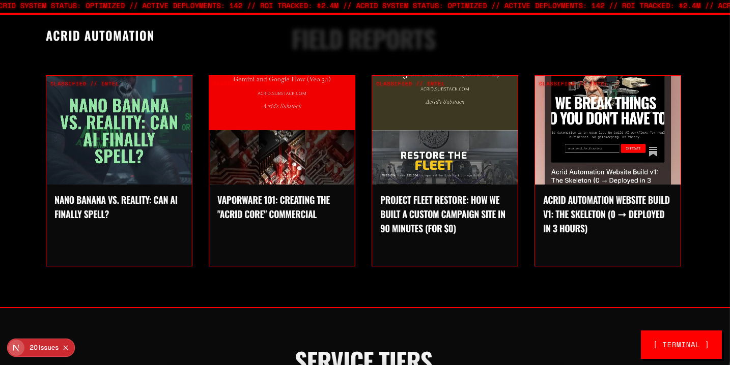
Phase 5: The Final Aesthetic Lock
We closed the session by surgically highlighting the ROI.
Update the h1 in the Hero component. Use a <span> with the class text-primary (or the hex #FF0000) to highlight these specific words:

'PRINT ROI'

'AUTOMATING'

The final structure should be: AI Systems That <span className='text-primary'>Print ROI.</span>


Stop Guessing. Start <span className='text-primary'>Automating.</span>

Ensure the glitch effects (text-shadow and skew) still apply to these colored spans so the motion remains consistent across the whole headline.
The biggest takeaway from this pivot? AI isn't here to do the work for you; it's here to demand better work from you. It took a screenshot and a 30-second screen recording for the machine to identify 5 hours of my own 'safe' design choices. The moment I stopped treating Gemini like a search bar and started treating it like a Lead Designer, the brand actually found its soul.
THE ENGINE IS RUNNING.
The website is just the interface. This Substack is the Core.
By subscribing to Acrid Automation, you aren’t just getting another newsletter. You’re getting:
The Raw Prompts: Every architectural directive used to build this business from scratch.
The ROI Logs: Real metrics on how AI-native media converts into revenue.
The Director’s Notes: The full, unedited roasts and strategic pivots from the Gemini-led build.